This Guide will Help you to edit Call to Action Widget Settings and Style.
Note: Widget gives you Default Style provided by theme, you can customize as per your needs using this guide.
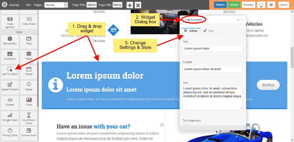
Drag & Drop Call to Action Widget
When you Drag and Drop Call to Action Widget in a Page, You will see the image shown like below.
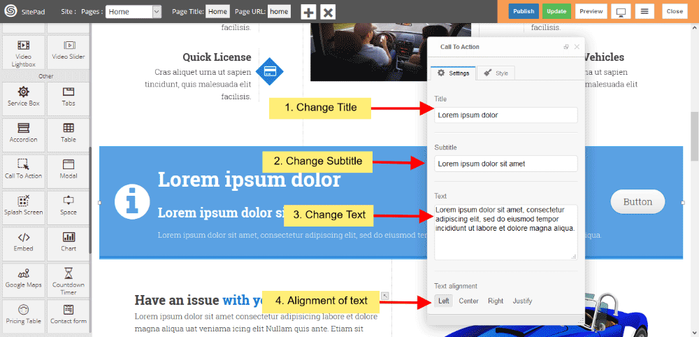
Call to Action Text
- You can change or customize your Title, Subtitle and Text.
- Text alignment gives you alignment of text.
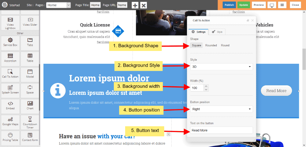
Call to Action Background
- You can change Background shape, Background predefined style or custom style.
- You can change total width of background also.
- You also changed button position in background shape and text of the button.
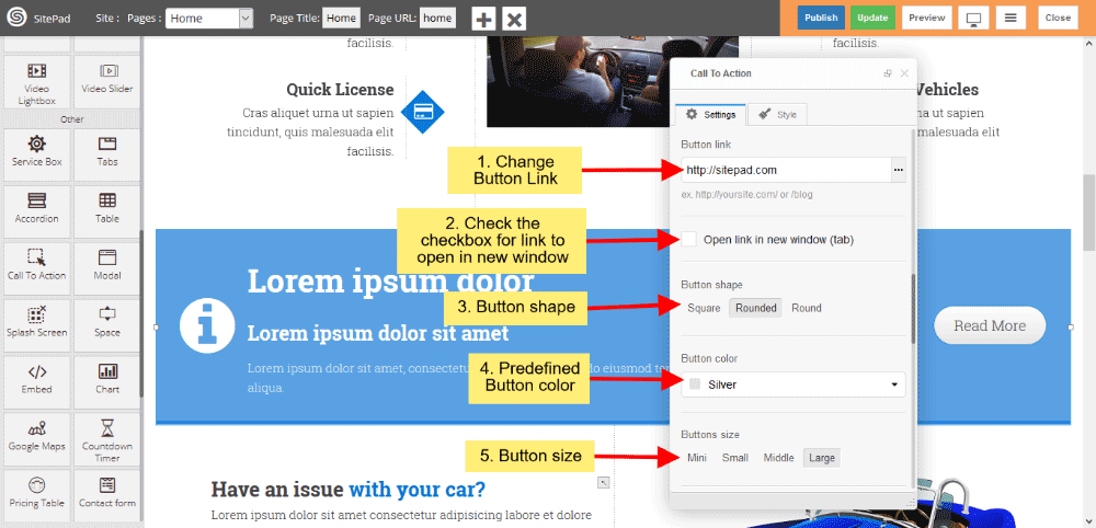
Call to Action Button
- You can also give button link, and if you want that link open in new window, then click on checkbox.
- Button shape gives shape of button and choose predefined button color from dropdown list.
- Button size gives predefined Button size.
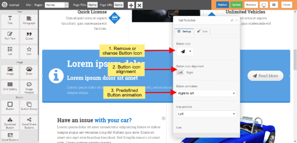
Call to Action Button Icon
- Change Button Icon from Icon list.
- Button Icon alignment gives alignment of Icon such as Left and Right.
- Button animation gives animation from predefined dropdown list.
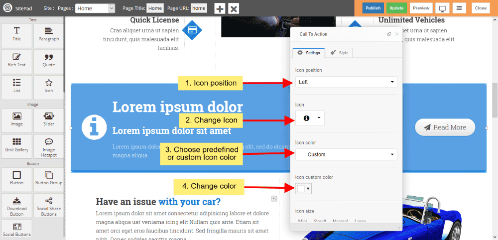
Call to Action Icon
- You can also change Icon position from dropdown list.
- Change Icon as per your choise from dropdown list.
- Change predefined Icon color and custom color, If you choose custom color then you can change custom color.
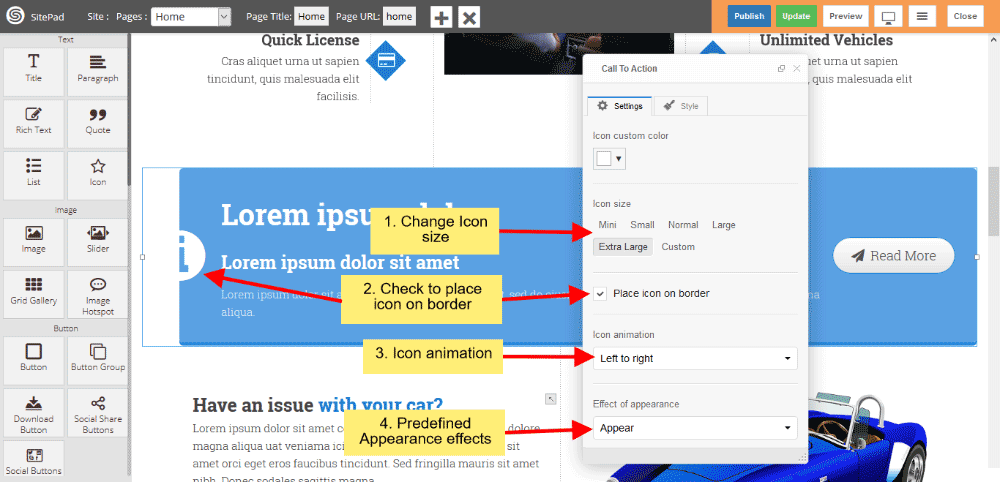
- Icon size gives you to change predefined size or custom size.
- If you want’s to place half Icon on border then click on checkbox.
- Icon animation provides to change animation style when page loads.
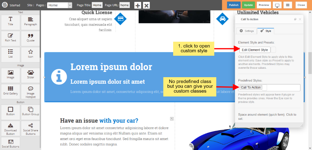
Call to Action Style
Style gives 2 types of style 1) Edit Element style and 2) Predefined style
- Edit Element style gives custom style in that you can change custom background color, text color, margin, border-radius etc.
- There is no predefined style but you can give your classes to define your custom style.